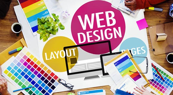
10 Principles of Modern Web Design
By Space Coast Daily // August 12, 2019
Web design is judged by the users of the website, not the designer or the business owner. Several factors contribute to the success of a website’s design, and it’s not just about how good it looks; it’s also about performance and functionality.
Poorly designed websites fail to convert visitors into customers and usually suffer from poor analytics (high bounce rate, low session duration, low traffic).
According to HubSpot, 38% of people will stop engaging with a website if the layout is unattractive. So what is good web design? Below are ten principles of modern web design that increase user engagement, boost usability, and improve the aesthetic appeal of web pages.
Hire the best design agency Bay Area for your website project.
1. Visual Hierarchy
Although it sounds simple, the more prominent the visuals of page element, the more attention it will receive. Visual hierarchy is one of the most essential principles of modern web design. It’s the order in which the eye processes what it can see.
Some aspects of your web page are more important than others, you want these elements to get more attention than the less important elements. The first stage of establishing visual hierarchy is to rank the elements of your page based on your business objectives. Which elements do you want users to focus their attention on?
Make the most important elements stand out by utilizing font size and positioning. Amazon makes the “Add to Cart” button on their product pages stand out by using a sharp color. Know the business goals of your web page and establish a visual hierarchy to direct users attention.
2. Hick’s Law
Hick’s Law states that with every additional available option, the time needed to make a decision increases. For example, if you visit a restaurant with a huge list of options the menu, it makes it more challenging to decide what to order. If they offered three or four options, making a decision is much easier.
In terms of your web design, the more choices that you offer users, the more difficult it is for visitors to use. To improve the usability of your website, focus on eliminating unnecessary and distracting options.
3. Fitt’s Law
Fitt’s Law states that the time required to move to a target (click on a button or CTA) is a function of the size of the target and the distance covered. In plain terms, the bigger and closer a target is, the easier it is to use.
This doesn’t mean that you should dedicate half of your web page to your CTA button. A tiny object given a 30% increase in size is easier to click, but a large object given a 30% size increase won’t see the same improvement in usability.
The size of your buttons should be in proportion to their frequency of use. Make the most popular buttons larger than buttons that are used less often.
4. Rule of Thirds
Images are crucial to good web design. Visual elements can communicate a message much faster than a text-based medium. The most visually appealing images usually follow the rule of thirds.
The rule of thumb is to break an image into equal thirds both horizontally and vertically, dividing the image into nine equal parts.
The interesting elements should be placed on the intersections between these lines (sweet spots) to provide balance and to align with the way we naturally view an image.
When it comes to your page layout, the most important elements should be placed in the sweet spots. This not only makes your page more aesthetically appealing but also helps to direct user’s attention to the crucial elements.
5. White Space
White space refers to the sections of a web page that remain blank or empty. It’s the space surrounding and between the content, margins, and graphics. White space is a crucial element of web design and shouldn’t be considered “wasted” space.
White space allows room for the elements of your page to breathe and is crucial in establishing hierarchy of information. The more elements, the more your user’s attention is divided. A page crammed full of images and text appears cluttered and is difficult to digest.
Ample use of white space provides a clean look to your web pages and is vital for communicating a clear message to your users. The more that people understand your message, the more likely they are to commit to your intended action.
6. Simplicity
Magicdust, who specialises in modern website design, advocate that simplicity is what you should be striving for with your design choices. People aren’t going to be accessing your site to admire the design. They have a goal they want to accomplish, and will only stick around for as much time as necessary to achieve it.
Websites with a simple design are faster to load, easier to scan, and more intuitive to navigate. Keep your user in mind and eliminate unnecessary or distracting content, pages, and design elements.
7. Effective Writing
Writing for the web is different to writing for traditional media. Long blocks of text will be skipped and exaggerated sales copy will be ignored. It requires copywriting skills and knowledge of user’s browsing habits and preferences.
Know who you are writing for and keep it clear and concise. Improve the readability of your content by breaking it up with subheadings and bullet points.
8. Web Design Conventions
There is a time and place for experimentation, but that isn’t your web design. It would be a nightmare for users browsing the internet if every website had completely different navigation, layout, and visual presentation.
People have certain expectations when they land on a website. If they can’t find their way around or get frustrated, they’ll leave. Sticking to the best practices and conventions helps users interact with your site and develops trust and credibility.
9. Don’t Force Users To Think
The more people are forced to think, the more likely they are to get distracted and disengage from your site. Good web design is self-explanatory and straightforward, eliminating the questions and conscious decisions a user has to make.
If the layout and navigation of your website isn’t intuitive, the user is forced to think how to find what they are looking for. A clear and intuitive structure help users find their way around and achieve their goals.
10. Testing
Testing is a crucial stage in developing and optimizing a website. With so many different devices and browsers available, it’s essential that your site functions effectively no matter how a user chooses to access your site.
It’s essential to identify and fix issues before they affect your visitors, 52% of people state that they will be less likely to engage with a company after experiencing a bad mobile experience. From slow page speeds to formatting issues, several problems can frustrate users and harm the credibility of your business.
Conclusion
Your website is much more than lines of code and pixels. It’s the first impression your business will make on potential customers. While you don’t need to be an expert in web design, you need to have someone on your team that has a firm grasp of the above principles and knows how to implement them on your website.
That way, your company will make a positive impression that encourages visitors to interact with your business and explore the products and services you have to offer.

CLICK HERE FOR BREVARD COUNTY NEWS