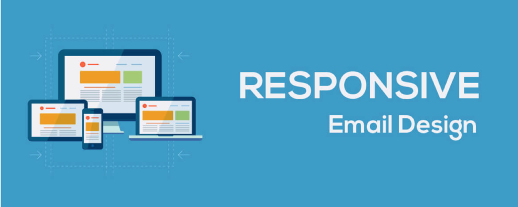
5 Responsive Email Design Best Practices Every Business Must Follow
By Space Coast Daily // September 28, 2020
Emails are one of the most widely used channels for marketing by businesses, large and small.
This is because emails have become an inevitable part of peoples’ lives and the number of email users worldwide is growing at a steady rate each year. Hence, businesses can leverage this medium to showcase and promote their brand and get more customers.
While the number of email users worldwide is expected to grow up to 4.3 billion by 2023, according to EmailMonday, 23-78% of all email opens first happen on a mobile device. This means the emails are more likely to be opened on mobiles than on desktop or any other devices. It is therefore more important than ever to design emails that are responsive and can render well on mobile devices.
So, what is a responsive email design?
Responsive emails refer to designing the emails in a way that is customized to each of your end-users’ devices. The design can change based on the size of the screen it is being viewed. Custom made Mailchimp templates, Salesforce templates and Pardot email templates offer a range of responsive email designs to choose from, that can be scaled and rendered on multiple devices and screens.
These emails use CSS media queries to create multiple copies of your email design. The layout, images, content, and buttons in the emails adjust automatically depending on the size of the users’ screens.
Best Practices for Creating Responsive Emails
1. Layout: Make it easy to navigate
Multiple column layouts become difficult to navigate and read on mobile screens. It is therefore vital to have a single column layout with the optimal width of 320px, to ensure it is easy for the users to read the email. Single column layouts can be viewed perfectly across various screens and email clients. It also helps in drawing the focus of your subscribers to the important parts of your content by highlighting specific elements of the email.
Check out this email from UXpin. And, the image at the right shows how it will look on iPhone X. The email has a single column layout, which makes it easy to read on smaller screens as well.

2. Fonts: Make it readable
Your email text should be big enough for your users to read without straining their eyes. Use fonts that are clear and legible. Choose a font size of at least 13 to 14 pt for the body text and 20 pt for the headings and titles. This will make it easy for your users to read it even on smaller screens.
Here’s an email from Jack Mason that uses clear and large fonts for the title and body content. The size of the font increases dynamically for smaller screens, making it readable, as shown in the image at the right.

3. Content: Make it short and crisp
Arrange your email content in a way that the most important part of your information appears at the top and lets the readers to focus on it. Keep the content short and simple and include only the most vital information so that it is displayed properly across various screen sizes. Focus on providing a good user experience on mobile.
Take a look at this email from the brand Webflow. It has included the most important part of the message above the fold. The image is smaller and the text and CTA button are bigger and more prominent in the mobile layout.

4. Links and Buttons: Make them clickable
If your email content has hyperlinks, make sure there are not too many of them that would make the email look cluttered. Use long hyperlinks that the users can easily click on. Also, the CTA buttons that you use must be large enough for mobile users to tap on them easily. The ideal size of the CTA button must be at least 40 X 40 pixels.
Check out this email from Noom. It uses a long text for the hyperlink, which appears bigger in the mobile layout and can be clicked easily. The CTA and the unsubscribe links are also prominent and can be tapped without a lot of efforts.

5. Images: Make them responsive
The images in your email take longer to load and download on mobile screens than on desktops and larger screens. It is therefore important to optimize the size and quality of your email images for smaller screens. Don’t make the emails too image-heavy as not all email clients support images, and they might fail to load. If you include images, make sure you add a supporting alt text that describes the image and serves the purpose in case it fails to render.
Netflix uses multiple images in its email. However, the mobile version has an optimized and responsive layout with smaller images and bigger text, making it accessible. Check it out!
Most importantly, TEST your emails
Before you hit the send button, test your responsive email to make sure it renders perfectly on various screen sizes. Check across a variety of email clients and mobile devices to see if it displays as you have planned. Use various dimensions and variations of images, text, CTA buttons, layout, etc. to see what works best for your campaign goals.
By following all the above best practices, your responsive emails will render appropriately across multiple screen sizes and devices. Responsive emails offer better user experiences, which leads to higher engagement and conversions.
Author Bio
Kevin George is Head of Marketing at Email Uplers, one of the fastest growing PSD to Email coding companies, and specializes in crafting professional email templates, responsive HTML email templates design and coding in addition to providing email automation, campaign management, and data integration & migration services. He loves gadgets, bikes, jazz, and eats and breathes email marketing. He enjoys sharing his insights and thoughts on email marketing best practices on his blog.


