Company Web Series #2 – Visual and Layout Musts for Your Website
By Rock Paper Simple // April 1, 2012
Why your website layout and design is important
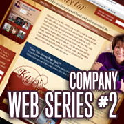
You have five seconds to capture your visitor’s attention and trust or your visitor will leave… be sure your website doesn’t lose your prospects before you even have them!
Your website’s visual appeal and layout is absolutely critical in grabbing and keeping your visitor’s attention. Remember the “twitter mentality” of 140 characters… we want it fast and easy and if we don’t get it, we move on. You must ensure your website looks trustworthy AND is easy to understand. These two are often referred to separately as the visual design and the functionality.
Visual design is how “professional” or “pretty” or “cool” the site looks while the functionality is how it works and how the user interacts with it. Both of these work hand-in-hand and sometimes it is hard to differentiate the two.
Visual Musts
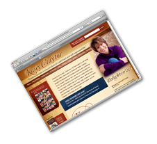
Your site needs to visually impress. It does not need to be the next Michelangelo work of art, but it should look modern and professional and convey trust to your visitors. They keyword here is TRUST. If your site looks outdated or cheap, it will harm your brand and decrease trust within your visitor; and that can be devastating for your web presence. In fact, it may have been better to have no presence at all than have one that damages your brand trust.
Does this mean you need all the fancy bells and whistles and an expensive custom design? While it doesn’t hurt, not everyone has a fully custom website in their budget and that is ok. A basic or standard site can still look modern and professional while not pulling out all the stops. This balance is really on your web developer or agency to creatively find a way to infuse your site with a visual presence that impresses no matter what your budget. It is also their responsibility to be honest about what can be done within your budget as well.
On a final note about the visual musts of your website; make sure the visual impact it presents properly represents your brand. If you are a lawyer, make sure that visitors think “lawyer” when they visit the site. If you own a software development company make sure that visitors will think “software” or “technology” when they first see the site. Everything about your website communicates. Make sure it communicates the proper message.
Layout Musts

What do I mean when I say they will notice if your website is not easy to understand? Functionality! What I mean by this is there are many best-practices to observe when it comes to: logo and brand placement, navigation and call to action placement, content placement, etc.
Where your content, images, links and logo are located is actually very very important. People have become very familiar with how websites are “supposed” to work and where things are “supposed” to be and your web developer or agency can help you understand these things. Some of these layout best-practices are:
- Logo – Your logo or brand should always be represented in the upper left hand corner of the site. Visitors are used to looking there to identify where they are on the web. Locating your logo elsewhere may cause confusion and confused visitors will move on to a different website.
- Navigation – The navigation should be at the top and be easily distinguishable from the design, taglines and content. This navigation or “menu” should not be wordy and should quickly communicate the visitors options. If they cannot quickly find what they want, they will move on.
- Call to Action – Three to five call to actions should be included on the home page… with one or two on inner pages. This helps the user get to the most important pages on your website. They expect this guidance and you need to deliver. You need to tell them where to go. I will explain call to actions in detail in my next article in this series.
- Consistency – It is of utmost importance that your layout and navigation have consistency. Your visitors will expect your primary navigation to be in the same place on every page and they expect your logo not to move either. It is best practice to keep the header and footer intact on every page. It is accepted to show a banner only on the homepage and drop it on the inner pages for efficiency and to make room for content, however the rest of the items in the header should typically remain consistent through-out the website. Typically the only page that will look dramatically different from the rest of the site is the homepage as it is the central hub of the site. Websites that do not remain consisten give off the feeling of being broken or unfinished and can cause bran distrust.
Combining the Two!
Remember that is both a science and an art to combine both visual design and functionality, especially within a budget. This requires knowledge and the foresight of planning ahead to ensure everything is smooth. This is one of the reasons Rock Paper Simple requires all of our website clients to provide all of their content as well as a filled out questionnaire before we begin a project. It is absolutely critical that we fully understand our clients before starting to develop their website.
You have five seconds to capture your visitor’s attention and trust or your visitor will leave… be sure your website doesn’t lose your prospects before you even have them!
Make sure that when you are moving forward with developing your website that you keep both of these visual and layout items in mind. Sometimes making sure you do not confuse a visitor means giving up a part of the visual design that was wanted or vice-versa. Good planning ensures a successful design. Of course design and functionality leads into our next article where I will elaborate on call to actions and how to direct traffic within your website for better conversions.
The next installment in our company web series:
Directing Traffic Within Your Website for Better Conversions
 Written by Joshua Adams at Rock Paper Simple
Joshua lives and breathes web development and internet marketing and is passionate about not only providing quality service, but also educating fellow business owners about internet marketing and web presence.









1 Trackback / Pingback